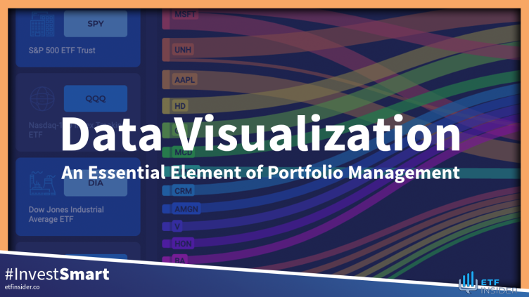
Data Visualization: An Essential Element of Portfolio Management
For years, investors have been forced to rely on data presented in tables and numbers, often leading to endless hours of analysis and interpretation. The spreadsheets and reports churned out by traditional data analysis methods can be overwhelming and confusing for even the most experienced investors, causing important insights and patterns in the data to be missed entirely.
But with data visualization tools, all of that is changing. ETF Insider's innovative data visualization platform is revolutionizing the way portfolio performance is enhanced. Complex models are transformed into visually appealing and easily digestible graphs and charts, allowing investors to quickly identify trends and make well-informed investment decisions. Not only does this save time, but it also increases the accuracy and effectiveness of portfolio management. In today's fast-paced and competitive market, data visualization is becoming increasingly essential for successful portfolio management - and ETF Insider is leading the way.
What is Data Visualization?
Data visualization is the presentation of data in a visual format, such as graphs, charts, and maps that clearly communicate patterns and trends in the data. With a growing amount of data being collected and analyzed in the finance industry, data visualization allows investors to easily digest and interpret large sets of data. ETF Insider's data visualization software not only tells a story with data but also allows investors to interact with and manipulate the data in real time. This kind of dynamic data visualization enhances portfolio management, allowing for greater flexibility and decision-making.
The Key Benefits of Data Visualization
In an increasingly data-saturated world, data visualization allows investors to cut through the noise and focus on what truly matters in their portfolio performance. Through a combination of technological and creative advancements, ETF Insider has developed data visualization tools that bring the following benefits to portfolio management.
Visualized Data Is Processed More Efficiently
Studies have shown that the human brain processes visual information 60,000 times faster than text. By presenting data in a visually appealing manner, data visualization tools allow investors to quickly and easily identify patterns, correlations, and trends in their performance data. This allows for more efficient decision-making and ultimately leads to improved portfolio performance. This not only saves time but also enables investors to stay agile and reactive in a constantly changing market. With the amount of raw data created worldwide doubling every two years, data visualization is becoming increasingly necessary for efficient data processing.
Data Visualization Highlights Key Insights
Not only does data visualization make data processing more efficient, but it also allows for the identification of key insights that may have been overlooked in traditional data analysis methods. The large swaths of data flowing into a portfolio can be overwhelming, but data visualization sifts through this data, highlighting the most important insights for investors. The visual nature of data visualization allows for easy comparison and contrast, allowing investors to pinpoint areas for improvement and potential growth in their portfolios. With ETF Insider's proprietary visuals, data insights are brought to the forefront, leading to better-informed decision-making.
Data Visualization Enhances Collaboration
In addition to its benefits for individual investors, data visualization also enhances collaboration between team members. By presenting data in a visually engaging way, data visualization allows for a common understanding of performance data when individuals with varying skill sets, learning styles, and data interpretation abilities come together to manage a portfolio. ETF Insider's intuitive platform makes it easier for team members to communicate and exchange ideas, leading to a more cohesive and effective portfolio management strategy.
Visuals are More Attractive and User-Engaged
Not only does data visualization improve the efficiency and accuracy of data analysis, but it also enhances the overall user experience. ETF Insider’s data visualization tools bring a level of creativity and visual appeal to data presentation, making investment information more attractive and engaging for investors. This not only improves the overall user experience but also helps to draw attention to data insights, leading to better portfolio performance.
Visual Data is Easier to Understand
Data visualization not only enhances the technical aspects of portfolio management but also improves communication with clients and other external parties. The visual nature of data visualization makes investment information easier to understand and present to various stakeholders. ETF Insider's data visuals allow for clear and concise communication, leading to stronger relationships with clients and improved portfolio performance as a result.
Data Visualization Provides Actionable Insights
Perhaps most importantly, data visualization tools provide actionable insights for investors. By presenting data in a dynamic and interactive way, data visualization allows for real-time manipulation and analysis, enabling investors to stay agile and make immediate changes to their portfolios in response to market shifts. With ETF Insider's visualization stack, investors can quickly glean insights on their portfolio's expected returns, past performance, asset correlations, and more, empowering them to make informed investment decisions - ultimately leading to improved portfolio performance.
Bringing the Future to Portfolio Management
In an increasingly data-driven world, data visualization has become an indispensable resource for successful portfolio management. Gone are the days of combing through dense data sets with traditional analysis methods. ETF Insider's data visualization tools are revolutionizing the world of asset management by bringing key insights to the forefront, enhancing collaboration and user engagement, and ultimately leading to improved portfolio performance. Experience the future of portfolio management and take your investments to the next level with ETF Insider’s powerful data visualization stack.
Get started