INTRO TO ETF INSIDER
ETF Insider is a tool to visualize financial portfolios from the perspective of their underlying assets. In
the
center is an interactive network diagram, you can use this to organize and navigate within a portfolio.
PORTFOLIO WINDOW
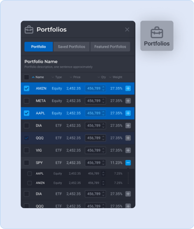
PORTFOLIO TAB
- All the assets held directly in the portfolio are listed here. If an asset contains other assets
such
as ETFs or MFs then you can expand that asset to see its full holdings.
- The quantities of assets can be incremented to make adjustments to the portfolio.
- Multiple portfolios can be saved. A saved portfolio can be loaded from the saved portfolios tab.
- Featured portfolios are prebuilt portfolio examples.
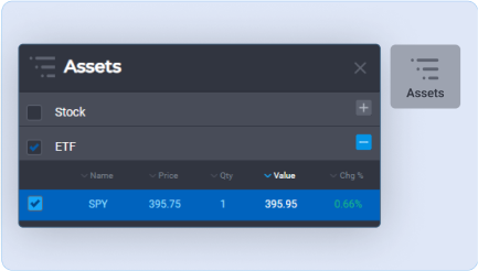
ASSETS TAB
- The assets tab is a list of all assets held directly and indirectly in the portfolio.
- For example if the portfolio contains one unit of the S&P 500 (SPY), then this list would contain
all
the equities in SPY. If the portfolio contains SPY and Dow Jones (DIA) then the assets list would sum
and list all the assets in both funds.
- Assets selected from this list are reflected in the network diagram and vice versa.
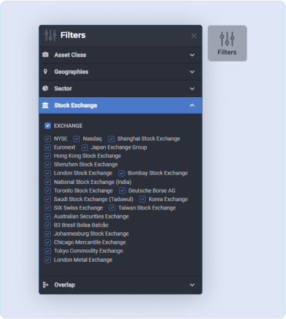
FILTERS TAB
- Assets can be removed from the network diagram with filters based on selected criteria.
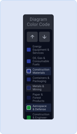
LEGEND
- The legend is a tool to easily make selections based on how the network diagram is color coded.
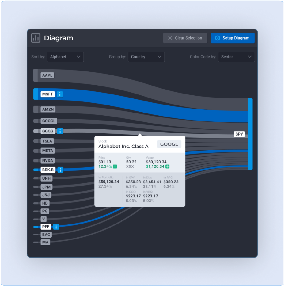
NETWORK WINDOW
Exchange traded funds are normally just baskets of other financial assets like stocks or bonds.
Visibility into the holdings of those assets is the problem that ETF Insider solves.The network diagram
breaks down exchange traded products into their constituent holdings and groups similar holdings together.
NETWORK DIAGRAM
- Assets which contain other assets are parent type assets (ETFs, Mutual Funds), assets held within
another asset are child type assets (stocks, bonds, cash). These assets can be held in the portfolio
directly or indirectly as part of a parent type asset.
- ETFs often have substantial overlap between them exposing people to high degrees of concentration
risk. With the network diagram, the overlap between such assets are clearly visible.
- The height of the links is relative to the asset weight.
- Mouse over on a link in the network diagram displays a popup with the exact breakdown of that assets
weights and holdings in the portfolio.
- The links of the network diagram can be selected. Selected assets are highlighted in the assets tab
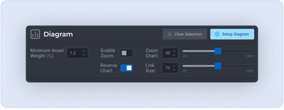
SETUP DIAGRAM
- Minimum Asset Weight (%)
- Determines the proportionate amount of assets displayed from each fund. lowering this value will
increase the total amount of assets shown.
- E.g. By default only assets with a minimum weight within the SPY greater than 0.7% are displayed.
- Display Assets - Toggle link title between asset name / asset symbol
- Reverse chart - Reverses the sides of the network diagram
- Zoom Chart - network diagram zoom
- Link Size - Sets the vertical size of the network links.
- Enable Zoom - toggles the zoom function on mouse scroll wheel
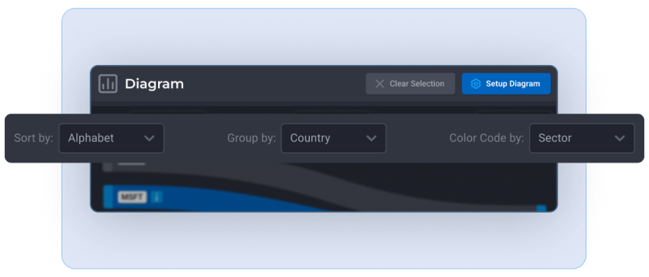
NAVIGATION BAR
- Sort By - Sets how the child type assets are sorted
- Group By- Sets how the child type assets are grouped
- Color By - Sets how assets are color coded. This setting also sets the legend allowing the user to
easily make selections.
PORTFOLIO ANALYSIS WINDOW
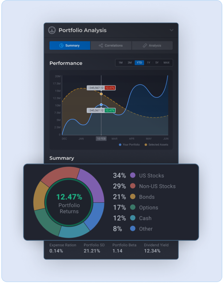
SUMMARY TAB
- Performance chart - A performance chart of the portfolio and of all the selected assets. The blue
line
is the performance of all the assets held in the portfolio directly and the dotted yellow line is the
weighted performance of all the selected assets.
- Summary donut - a breakdown of all the child assets in the portfolio.
- Portfolio metrics
- Expense ratio - The cost of owning a fund. Usually defined as the percentage of fund assets
allocated for operating expenses and management fees.
- Standard deviation - A measure of the variance between the portfolio's return and the market's
return. At ETF Insider we use the S&P 500 as a measure of market returns. The greater the standard
deviation the greater the risk.
- Beta - A measure of the portfolio's price changes in relation to the market. Beta is used to
determine how the price of an asset or a portfolio moves relative to the overall market. The greater
the beta the greater the assets price will fluctuate relative to overall market fluctuations.
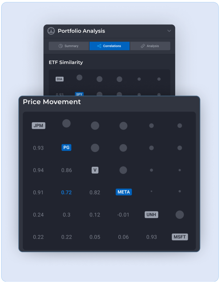
CORRELATION TAB
- Etf similarity
- A matrix displaying the overlap between all fund type assets in the portfolio. Overlap is
calculated
as the percentage amount of assets shared between the funds.
- Price movement
- A matrix displaying the price movement correlation between selected assets. Measured between
positive and negative 1; Where positive 1 indicates perfect positive correlation between the asset’s
market price movements.
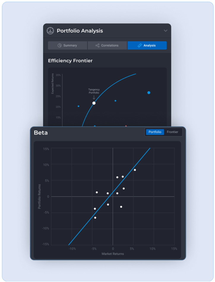
ANALYSIS TAB
- Efficiency frontier
- A graph of risk (measured in standard deviation) to expected returns. The higher the risk of an
asset one can expect a higher expected return to compensate for that risk. An efficient asset is one
that has the maximum potential expected return for a given level of risk.
- The efficiency frontier curve is a graphical representation for the optimal level returns at any
level of risk. The closer your portfolio is to the efficient frontier, the more efficient your
portfolio is in terms of being compensated for the risk level taken.
- Circles are equity type assets
- Triangles are ETF type assets
- Squares are Mutual Fund type assets
- The red diamond is the portfolio total.
- Beta
- A measure of the portfolio's price changes in relation to the market. Beta is used to determine
how
the price of an asset or a portfolio moves relative to the overall market. The greater the beta the
greater the assets price will fluctuate relative to overall market fluctuations.
- The graph plots the portfolio's returns relative to the market's returns over the past one month
(At
ETF Insider we use the S&P 500 as a measure of market returns). Each point on the graph represents
how
the portfolio performed given the market's performance with a regression line.